New website! Previously alanapirrone.com.au

  • Home
  • Training
  • Work
  • Blog
  • Mailing List
  • YouTube
  • About
  • Contact

Infographics & Data Visualisations

Infographic developed for the Movember Foundation

    Reports

    2021 Annual Report for the Child and Community Wellbeing Program. Full report found here

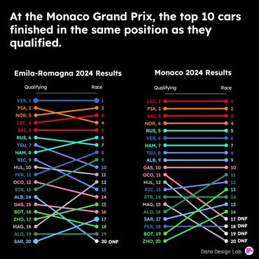
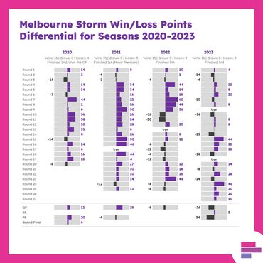
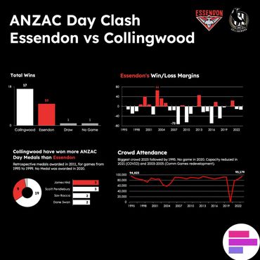
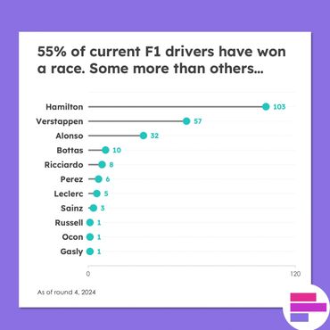
      Sports Visualisations

      Two slope charts looking at the difference between qualifying and race result in F1
      Dashboard which bar charts, pie chart and line chart showing the history of ANZAC day clashes
      Lollipop chart showing F1 race wins
      • Training
      • Work
      • Blog
      • Mailing List
      • YouTube
      • About
      • Contact
      • Terms and Conditions

      Data Design Lab

      PO Box 304, North Essendon VIC 3041

      Copyright © 2024 Data Design Lab - All Rights Reserved.

      Powered by

      This website uses cookies.

      We use cookies to analyze website traffic and optimize your website experience. By accepting our use of cookies, your data will be aggregated with all other user data.

      Accept